Posts filed under “Art”
WHY PRE-MODERN ART IS EVIL.
Why is that? It does not seem immediately obvious that it should be so. It is true that the past is evil in trendy intellectual circles, but the Impressionists and the Fauves and the Cubists and anyone else before about 1968 lived in that era of pure evil. Why are their paintings not tainted by their era?
Dr. Boli has been thinking this problem over, and he has come up with a hypothesis. It is just like every other hypothesis you hear on the Web or in social media of various sorts, in that it comes straight from the brain to the keyboard without any intermediate fact-checking or reconsideration. Where it differs from the others is in that it comes straight from the brain of Dr. Boli, and thus earns a place in his Magazine.
It seems to Dr. Boli that the use of the term “moderns” for everyone from the Impressionists on accurately reflects a fundamental change that came over the art world. This change, in turn, causes museum curators and other second-rate art critics to approach the art from before and the art from after in two fundamentally different ways.
Let us take a look at this delightfully amusing painting by Jehan Georges Vibert, An Embarrassment of Riches:

This was one of the Academics who sneaked into the “French Moderns” show at the Frick in Pittsburgh. How was it painted? For most viewers, the answer will simply be “I don’t know.” The painter certainly didn’t want you to know. The object in making such a painting is that the technique should be invisible. You should not be thinking about the painter wielding a brush. You should be thinking about what the painter has depicted. If you enlarge the photograph, you will not see brush strokes at all: you will simply see the blotchy artifacts of a high-ISO picture from a cheap phone camera.
Now let us look at this Renoir, The Vineyards at Cagnes:

This was the painting used on many of the posters advertising the exhibition. You hardly even need to enlarge the picture to see the brush strokes. If you enlarge it, you will see not only brush strokes but also the texture of the canvas as it caught the brush. Every aspect of the painting reminds you of the brilliant painter standing in front of the canvas daubing it with gorgeous colors. The technique is, as the young people would say, in your face.
This is the great change that came over the art world. From the Impressionists on, the technique of the art was on full display, whereas the art of most eras before put all its effort into making the technique disappear in the finished product.
It is Dr. Boli’s hypothesis that the curators of today have lost the ability to parse art of the pre-modern age. They have very sensitive and well-trained eyes for technique; when the brush strokes are right there in front of them, our art experts can describe them and classify them with minute accuracy. But when the technique is made as invisible as possible, they have nothing to talk about. The thing that attracts their attention is the picture. And it is a picture of something, and therefore it is the something that they judge, and not the art.
Let us look back at the Vibert again. What do we notice if we judge it as a picture? We notice a number of extraordinarily clever things the artist has done. Note, for example, the mirror. It is a small canvas, so to make the obscenely rich cardinal the subject, the painter can afford only a small amount of background. The mirror, however, shows us the distant reflection of the opposite wall, with its rich gilt decorations. It is a way of painting a huge room without painting a huge room. Now look at the floor. Notice how the colors of the urn and the cardinal’s red cardinal suit and the details of the ornaments on the wall are subtly reflected in the expensive parquet, showing that the floor is perfectly polished and has had no more indelicate feet than the gentle pitter-pat of a cardinal’s red slippers on it since the polishing. Notice also the petals that have fallen from the bouquet, emphasizing how rich and huge it is: in spite of the obvious constant attention of the cleaning staff, it is not possible to keep up with so many petal-dropping flowers.
These are observations that might profitably be suggested on a plaque next to the painting, so that the gawking visitors might have some way of beginning to understand what the artist was up to. It is Dr. Boli’s hypothesis that they do not appear because museum curators simply do not know what the artist was up to. They have lost the ability to look at art of the pre-modern age and see it the way either the artists or the artists’ original audience would have seen it. They do not find brush strokes or garbage glued to wood or anything else that would be an obvious indication of the work the artist did, and they have largely lost the ability to judge composition and the various subtleties we just mentioned. Therefore their minds unconsciously fall back to the the subject of the picture or sculpture, and their judgments are about that subject, not about the artist’s technique. Then, of course, the dominant intellectual forces of our time assert themselves, and since the painting shows a scene from the past, our curators must make it clear that they have repudiated the wickedness of the past.
That is Dr. Boli’s hypothesis. It is probably all wrong, as most similar witterings whooshing through the tubes of the Internet are. But this is Dr. Boli’s own Magazine, and as editor he is qualified to decide which of his own witterings will be published. Today he had nothing else prepared, so you get this one.
A SIGN FOR YOUR FENCE.

WHAT’S WRONG WITH THIS PICTURE?
It has become the norm in museums to post explanatory plaques beside works of art, the plaques not only explaining who the artist was and where the work fits among the various artistic trends and fads, but also telling us what we are supposed to think of the art.
While wandering through the splendid “French Moderns” show at the Frick Art Museum in Pittsburgh the other day, Dr. Boli noticed a particular tendency among the plaques for the various works. The exhibition gathered a number of the Impressionists, the “Fauves,” and a few later modernists, but it also included half a dozen Academic artists as well to show us what the modernists were rebelling against. How, after all, can you understand Renoir without knowing about Bouguereau?
What Dr. Boli noticed was that the plaques for the Academics were likely to explain why the art was evil, whereas the rest—all the works that are usually lumped as “Moderns,” from the Impressionists on—would just explain who the artist was and what the artist was trying to do. The explanations might not be very good, but they were at least about the art.
Once he noticed this tendency, Dr. Boli realized that he had seen it on every recent trip to an art museum. Art from before the Impressionists is likely to come with an explanation of why it is morally wrong, but an artist with “Modernist” credentials seems to be exempt from moral examination.
Thus we can make a trip to the museum into a sort of guessing game, or perhaps an exercise in creative imagination. For every realistic or pre-modern work of art, we try to imagine what a museum curator would think was morally unacceptable about it.
Here are a few examples to get us started.

The Carpet Merchant of Cairo, by Jean-Léon Gérôme. What’s wrong with this picture?
“Although his detailed rendering of two carpets lends this painting a documentary appearance, Gérôme’s stereotypical portrayal of an Egyptian vendor and brightly costumed passerby reveals his desire to appeal to European fantasies of the Arab-Islamic world. In France, such imagined scenes were interpreted as faithful records of an unchanging ‘Orient,’ helping to justify and obscure the harrowing transformations enacted by European imperialism within North Africa and the Middle East.” Now, it is also possible that Gérôme painted a Cairo street scene this way because Cairo streets looked like this. He had been to Cairo and toured Egypt and loved every minute of it. But we know he was a bad man, because he painted in a pre-modern style, so he must have been conniving with perpetrators of atrocities to hide the evidence of their crimes, which as everyone knows is most effectively done by pictures of men selling carpets.
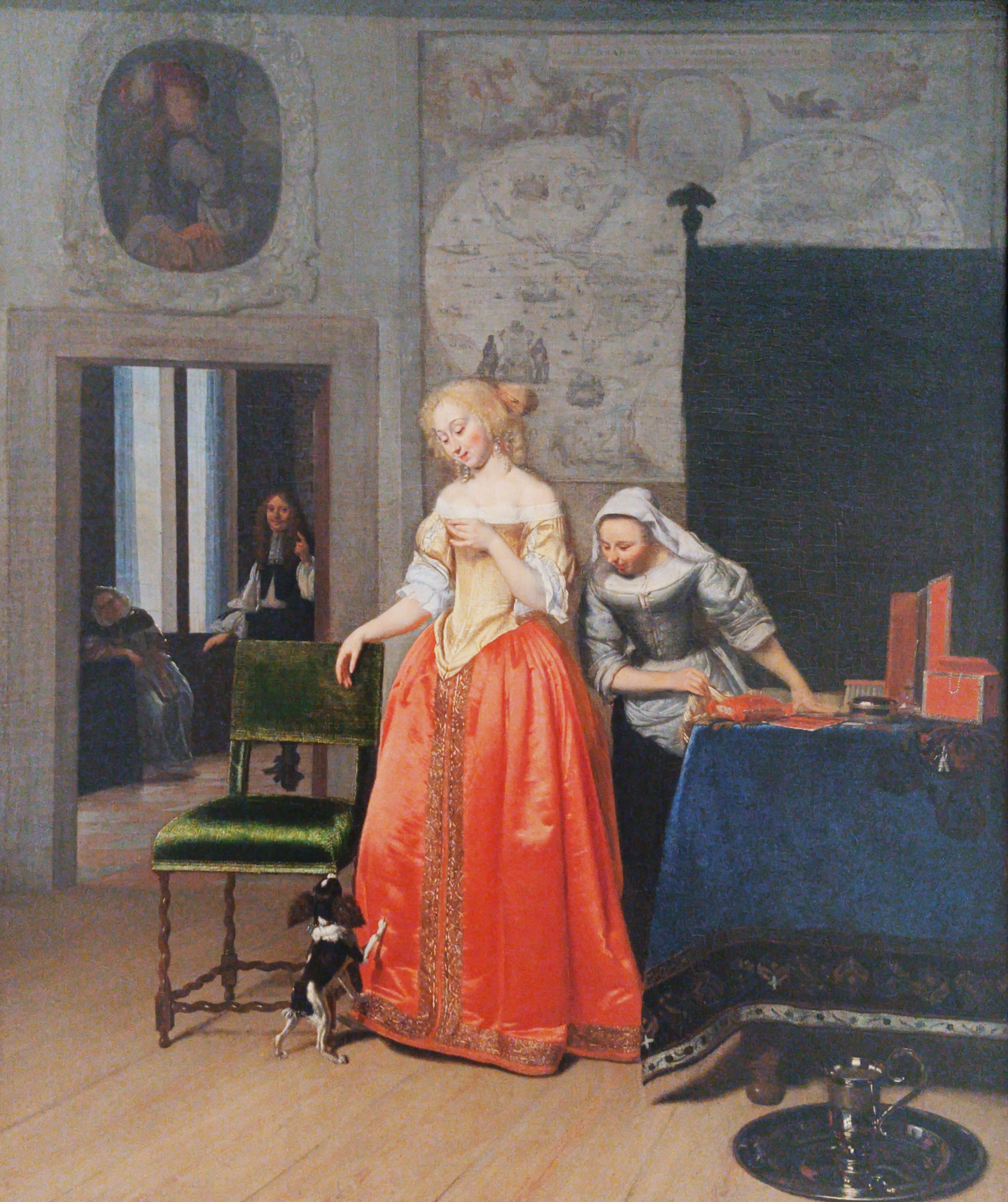
Lady with Servant and Dog, by Jacob Ochtervelt (c. 1671–1673). Here is a charming little domestic scene showing everyday life in a Dutch household. But we know it must have sinister implications, because it was painted before anyone had even heard of Impressionism. What’s wrong with this picture?
The “boastful world map” in the background reminds us that horrible colonialists were perpetrating colonial horrors. It’s true that the canvas is small, so there are no clear details on the world map, but to possess a world map is crime enough in a seventeenth-century Dutch family.

Here is part of the long series of murals in the Grand Staircase of the Carnegie Institute, showing crowds marching toward enlightenment, which they will never reach because John White Alexander, the artist, died before he could paint the symbolic figures of the Noble Quartet (Art, Science, Music, Literature). What’s wrong with this picture?
According to a plaque on the wall, the crowd does not accurately represent the racial or economic makeup of Pittsburgh.

Pourquoi naître esclave ? (“Why Born a Slave?”) by Jean-Baptiste Carpeaux (1868–1870).
Here is a bronze bust made as a deliberate rebuke of the enslavement of Africans. Surely, even in our age, when art is judged only by the quality of its political expression, this work must be above reproach. But no: it was sculpted in a pre-Impressionist style, and therefore it is morally compromised. What’s wrong with this picture?
“Created twenty years after the abolition of slavery in the French colonies (1848), the bust was meant to appeal to the antislavery views of a progressive white audience. Despite its seemingly sensitive portrayal of an individual, the bust nonetheless reinforces the objectification of the Black female body as an exoticized other…”
See? You can do it.
Now it’s your turn:

Innocence, by William-Adolphe Bouguereau.
You can answer in the comments: What’s wrong with this picture?
A SIGN FOR YOUR FENCE.

A SIGN FOR YOUR FENCE.

A SIGN FOR YOUR FENCE.

SHELF TAG…
…at a local store:

SMUG HUMILITY, OR HUMBLE SMUGNESS.
But this paradox is the world’s way of providing us with a few great artists. The truly great artists are the ones who absorb these two opposite lessons. It seems that a great artist requires humility and smugness in equal proportion.
Let us imagine for our purposes a dedicated and talented (but unfortunately fictional) artist, whom we shall call Joe Artist. Joe is just like all the other dishwashers who call themselves artists, except in one particular: Joe really is a genius. He paints in a unique style all his own: the best description of it is rococo cubism. When asked for an “artist statement” by one of the few galleries that would consent to exhibit his work, he was at a loss for words: he expresses himself in paint, not in writing. He finally, after many abandoned attempts, described himself as a representational painter who paints pictures of things that cannot exist but ought to.
Joe has never had much material success as an artist. He continues to exist because he is humble enough to realize that the world does not require his services as a painter, but it will pay him for washing dishes. This is the necessary humility that keeps him in the dish pit so he can remain alive and continue to paint.
But in the painting itself, Joe is confident past the point of arrogance. Over and over gallery-owners and art-show gatekeepers have told him that he needs to simplify his style radically, and that he could get into prestigious exhibitions if he would just put a political message about the oppression of his people (the name “Artist” is a corrupted spelling of a Basque surname) in his paintings, preferably in block capital letters. Joe knows that those people are wrong, because he knows that his art is right. He cannot take suggestions from anybody, because his art already is what it is meant to be, and a great artist cannot deliberately make his art worse. This may seem intolerable smugness, but it is necessary smugness. His certainty that he is producing great art is what makes Joe’s art great: if he ever lost that certainty, he would follow advice and perhaps prosper on the art-show circuit, and his art would be just like everybody else’s.
Humility and smugness are equally necessary to Joe’s continued existence as a great artist. But what happens if either bubble is burst?
If he loses the smugness, the most likely outcome is that Joe will cease to be an artist altogether. There are better ways of making a living than by washing dishes, but they may require a certain dedication that would preclude the dedication to art that keeps Joe painting. On the other hand, if Joe gives in to the temptation to listen to the gallery owners and art-show committees, he may in fact find that it is possible to make a living as an artist, as long as he is content to be a bad artist. Either way, losing the certainty that his art is right and necessary would be a mortal wound to his art.
If Joe loses his humility, the most likely outcome is that he loses everything else as well. He will decide that his art is so essential to the world that it ought to be his full-time occupation. He will not be able to make his art a paying job, because he will not make the necessary compromises, so he will become bitter and be driven to intoxication, possibly crime, and almost certainly early death. He may produce a few great works of art to be appreciated by future generations, but there will not be many, and the world will lose all the greater works he would have painted in his maturity.
So if you are an artist, and you find that the world is not rewarding you according to your merit, but you have accepted that you need to do some menial work to support your art—well then, you may be a great artist after all. Most likely you are not, but you have raised your chances.
THE OTHER SIDE OF HOLLYWOOD.

And even then, there was no guarantee that the artists who had made a profitable hit last year would do the same next year. The public demanded new movies, but new movies were risky by definition. Your contract players would act their hearts out, your cinematographers would pick out every detail in glorious Technicolor, your director would time each scene to the second—and yet the public might not like the movie after all.
But then there was the other side of Hollywood—the side you could rely on, the side where profits were guaranteed. This was the side of Hollywood where all the same talent and all the same technical wizardry that went into making this year’s Oscar-bait could be hired for a feature-length Technicolor musical fantasy about Westinghouse appliances. And here it is, thanks to the Library of Congress and the Internet Archive:
Just watch the credits—you don’t have to watch the whole hour and a half. The credits alone will drop your jaw six inches.
You can see the attraction for the studios. There was no worry about whether box-office receipts would pay for the production, because there was no box office. The corporate client was the audience, and the price was agreed on beforehand. This movie would make a profit, guaranteed.
And think how much more exciting it was to be an appliance salesman in those days. These days, the most exciting thing that ever happens in a salesman’s life is when some YouTube microcelebrity with a channel about different ways to cook broccoli shows up for a book-signing at the Best Buy. But in 1952, Westinghouse salesmen all over the country got to sit down in screening rooms and see the top talent in Hollywood giving voices to the appliances they peddled every day. It must have made a difference in the salesman’s morale when he could imagine every dishwasher as Maureen O’Sullivan.
The Internet Archive has a collection of more than 24,000 “Ephemeral Films.” Most of them were ephemeral for good reason, but every once in a while we run across a treasure. Perhaps Ellis in Freedomland is not exactly a treasure. But it would be hard to think of a general-release film more beautifully photographed than American Look, a 1958 widescreen Technicolor spectacular about the marvelous world of industrial design. “Improved styling constantly adds to the ease and grace and gaiety of American living,” says the narrator, and it is a tribute to the work of the photographers that we believe every word he says.
A SIGN FOR YOUR FENCE.
