Posts by Dr. Boli
RANDOM TRANSLATIONS.
Have you conceived a burning desire to know about optical telegraphy, or Augustine’s opinions on Scripture and science, or how Jules Verne’s novels were received by his contemporaries, only to run up against the insuperable barrier of a foreign language? If so, you may be interested in Dr. Boli’s new collection of Random Translations. It begins with some of the translations that have appeared in these pages over the years, but it has already added several new translations, and more will continue to be added as Dr. Boli continues to find curious passages in obscure untranslated books.
COMPLETELY LEGITIMATE.
According to a comment received just a few minutes ago, “You just received a money transfer of $ 89.44! PREPAYMENT!”
This is very good news. Now Dr. Boli can buy McKeesport and turn it into a theme park called Rust World, the way he has been planning to do for years.
But wait! How do we know this is legitimate?
Well, it could hardly be otherwise. The link in the comment leads to a site called OFFICIAL BANK SITE.
LANDMARKS OF SPIRIT PHOTOGRAPHY.

No. 2.—Mussolini pursued by hounds of hell in Ethiopia.
IF THE WORLD WERE IN COLOR…

What would it look like if the world were in color?
A monochrome world has a stark beauty of its own, of course. But what if we could see colors as well as shades of grey? This is the world our old friend Father Pitt decided to visit for a little while in his newest and oddest art project. He has created a world of Imaginary Color, and has begun to populate it with pictures of the world rendered as if the world were in color. So far the collection is small, hosted on an experimental site on a free server; but it demonstrates the principle. In theory, any monochromatic picture could be rendered in colors through the same process.
What is the process? It begins with an ordinary monochromatic picture. Some of the pictures old Pa Pitt has used were taken on monochrome film, but the same results can be obtained by taking a color picture and throwing out the useless natural colors. Then each segment of the image is hand-tinted, until the appearance of a colored landscape is created.
Is there any good reason for doing this? We hope not. Both Dr. Boli and Father Pitt abide by the principle emphatically stated by Mr. Oscar Wilde: All art is quite useless.
THE CURSE OF THE QWERTY KEYBOARD.
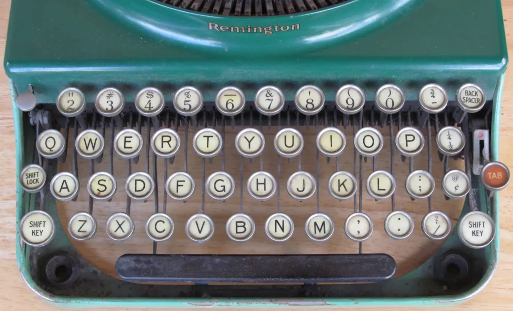
You, the enlightened reader, know what this article will say even before it says it. You know it because you have heard it said a dozen times before, as it has been said for more than a hundred years. The QWERTY keyboard is a pox on our intellectual life. This useless and counterintuitive system was foisted on us for the mechanical convenience of the very earliest typewriter makers, and it is only by a series of random accidents that it became the worldwide standard for English-language keyboards—and, with minor variations (like AZERTY or QWERTZ), the standard for other Western European languages as well. In a sane world, we would long since have replaced QWERTY with a more scientific alternative, such as the Dvorak keyboard, or the Blickensderfer DHIATENSOR.
Since you know all the arguments against QWERTY already, let us assume them made, and then Dr. Boli will get on with showing you why they are all wrong.
First of all, the only basis on which one keyboard could be said to be better than another is typing speed, and in that regard there is no good evidence at all that any of the proposed alternatives are better than QWERTY. The most studied alternative layout is the Dvorak keyboard, whose fanatical devotees have sponsored many experiments to show that typists retrained on a Dvorak keyboard type much faster than they did on a QWERTY keyboard. Of course the training here is the confounding factor; and indeed, when typists are given similar training on QWERTY keyboards, they show similar improvement. We are probably safe in concluding that it is not the keyboard layout but the training that effects the improvement.
In fact the old story that the QWERTY keyboard was designed to slow us down is almost the opposite of the truth, as far as we can make out the truth through the mists of the decades. The layout was designed (according to recollections many years after the fact) to prevent typebars from jamming in speedy typing. In order to do that, letter combinations that commonly appear together were placed some distance apart. You will note that the intention here was to speed up typing, not to slow it down. By spreading the keys apart this way, the QWERTY keyboard very often causes the typist to alternate hands while typing, and nothing speeds up typing more effectively than alternating hands.
Typists have set some astonishing speed records on QWERTY keyboards. Typewriter brands like Underwood and Woodstock sponsored speed typists to show that their machines could keep up with anybody. The speed of a fast typist has not significantly increased in the computer era: by 1900, typewriter technology had already reached such a peak of perfection in the very best machines that the human typist, not the machine, was the limiting factor.
It is not likely, then, that any alternative arrangement of keys will give us much greater speed. If that is true, then there is no good reason for changing the QWERTY layout. But there is every reason to keep it. The biggest advantage, in fact, is so obvious we are likely to miss it. The QWERTY keyboard really is universal for English speakers. There are variants in the placement of some of the symbols, but the letters are in the same places on every keyboard you come across. You can write a letter on your 1880 Remington, and then pick up your smartphone and send a text, and you are using the same keyboard. For once the invisible hand of the market has done its job. It has created a workable universal standard without the intervention of any committee or regulatory body or czar or dictatorship of the proletariat.
Like English spelling, the QWERTY keyboard survives because it does its job, because all attempts to reform it tie themselves up in the knots of their own inconsistencies, and because any attempt to replace it would require hundreds of millions of people to retrain themselves for no clear benefit. In the English-speaking world, it is likely that QWERTY will last as long as literacy itself, which should give it another five years at least.
PAST AGES WERE FULL OF IDIOTS.
“It used to be considered of poor literary quality, but a mass of recent writing (most notably in the Budé edition and commentary on the poem in 18 volumes) has demonstrated that it shows consummate literary skill, even if its distinctly baroque extravagance is for a modern reader a taste that has to be acquired.”
This is from the Wikipedia article on Nonnus of Panopolis, referring to his Dionysiaca, the longest epic surviving from antiquity. It is typical of the use of the word demonstrated in current academic writing about literature, a use that implies “case closed, no further argument necessary, objectively correct conclusion reached.” Past ages incorrectly assessed the literary quality of this work, but our own age has demolished their aesthetic judgment with science.
All right, but…
If you ask Dr. Boli to decide whose critical judgment is more likely to be objectively correct—a classicist of the nineteenth century whose taste may be a bit conventional, or a classicist of the twenty-first century who believes that consummate literary skill can be demonstrated like a proof from Apollonius—you will not be at all surprised by his decision.
LANDMARKS OF SPIRIT PHOTOGRAPHY.

No. 1.—The ghost of the Mona Lisa appears behind Abraham Lincoln just before the Battle of Gettysburg.
BUMPER STICKER.

ADVICE FOR LIBRARIANS.

Librarians like to cite titles without capitalizing any word but the first and any proper nouns. Thus The History of Tom Jones, a Foundling, is known in library catalogues as The history of Tom Jones, a foundling. This saves wear on the shift key and is not generally objectionable, but it does require some care in distinguishing proper nouns. For example, there is a world of difference between An introduction to Vulgar Latin and An introduction to vulgar Latin.
EDVARD MUNCH, ONE-JOKE COMEDIAN.

If you find a good shtick, you shtick with it.


