Posts filed under “Art”
ASK DR. BOLI.
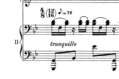
Somehow this marking found its way into Stravinsky’s Concerto for Two Pianos, making a mockery of Stravinsky’s carefully worked-out musical theories.
Dear Dr. Boli: I just ran across this quotation from Igor Stravinsky: “I consider that music is, by its very nature, essentially powerless to express anything at all, whether a feeling, an attitude of mind, or psychological mood, a phenomenon of nature, etc.” What did he mean by that? —Sincerely, Manfred Honeck.
Dear sir: He meant that music is by nature incapable of being played in a manner that could be described as accarezzevole, affannato, affetuoso, amabile, con amore, appassionato, doloroso, drammatico, espressivo, feroce, con fuoco, furioso, gaudioso, giocoso, impetuoso, lacrimoso, lusingando, melancolico, misterioso, rilassato, scherzando, serioso, sospirando, or tranquillo. When Stravinsky saw any of those markings in a score, he became molto agitato.
FOR THE BACK OF YOUR CAR.

ANSWER TO THE ARCHITECTURAL GUESSING GAME.


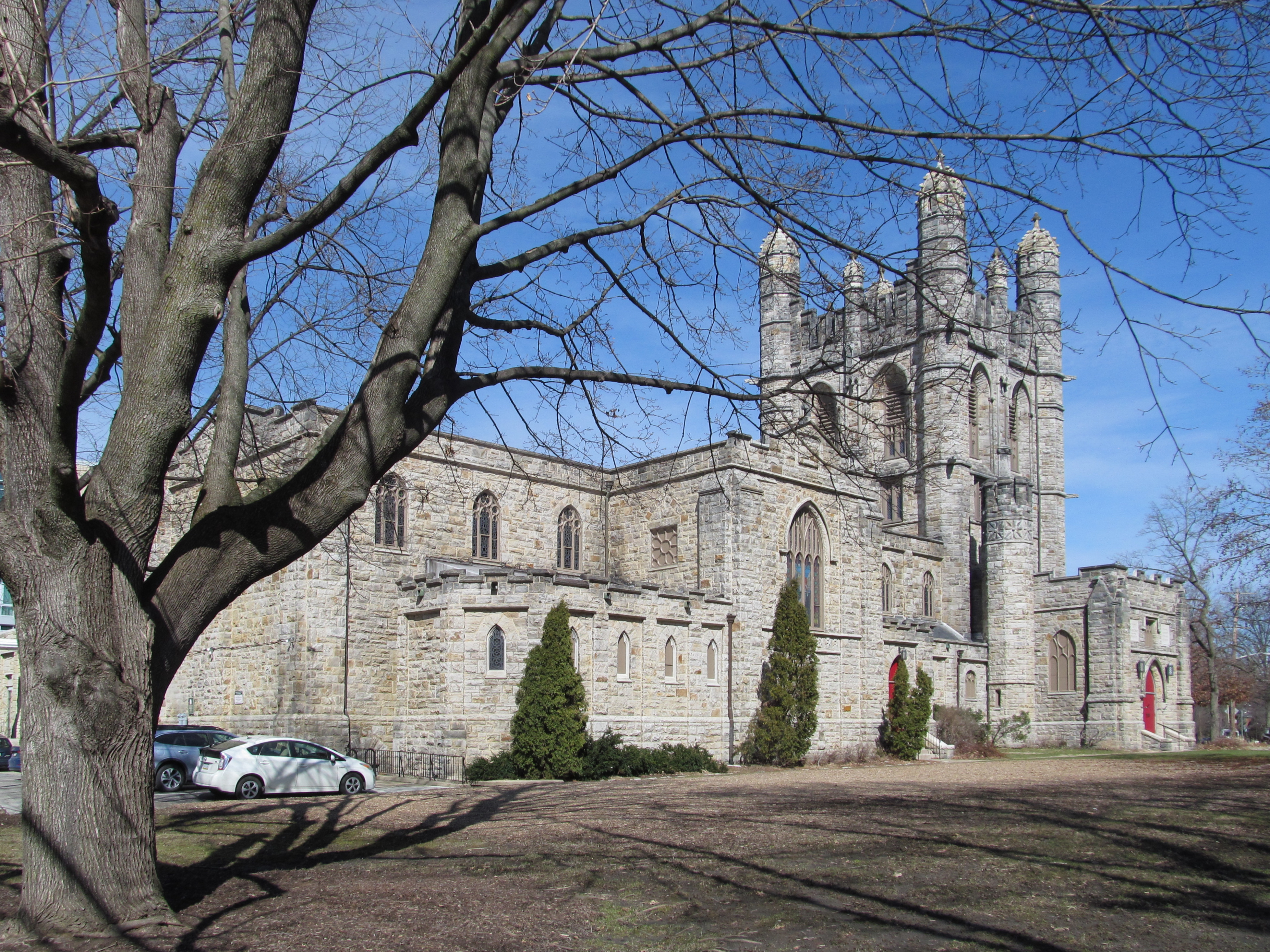

These pictures are donated to the public by Father Pitt, who also published pictures of this church back in 2013. In that article he wrote, “Right on the border between Oakland and Shadyside, the Church of the Ascension is one of the diminishing number of black stone buildings in Pittsburgh. Father Pitt hopes that his pictures will preserve the memory of our black stones when the last stone building has been sandblasted.” As he expected, those black stones did not remain black much longer. Here is how the church looked in 2013:
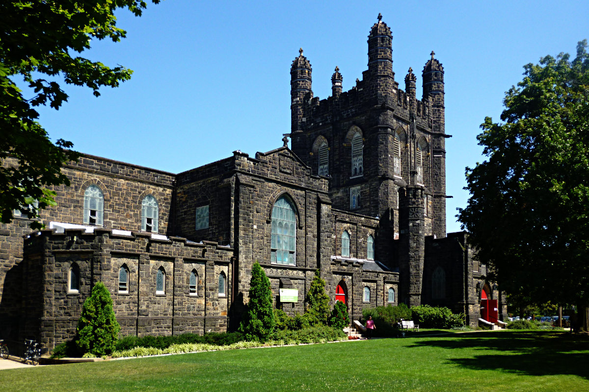
There was a time when all stone buildings in Pittsburgh looked like this. It was the architectural signature of the city. Since the soot stopped accumulating, however, more and more of the black stone buildings of Pittsburgh have been cleaned to reveal their original color. One wonders whether the architects ever really intended them to be seen that way. They knew what Pittsburgh’s atmosphere was like: did they expect their buildings to end up anything but black?
As Dr. Boli predicted, the guesses were entertaining, and in many ways more plausible than the truth. Truth often lacks plausibility, and something should be done about that.
“Mary,” for example, suggested that it might be a “neighborhood water tower with defense capabilities to keep the adjacent city council at bay.” In the jealously jurisdictional world of southwestern Pennsylvania, that is a very plausible idea. Every year the local papers run an op-ed piece about the many potential benefits of merging Pittsburgh and Allegheny County, the way Philadelphia merged with Philadelphia County long ago. It would create one of the ten largest cities in the country. It would consolidate many duplicated services and save millions. It will never happen, and if it were seriously threatened, every borough would build towers like the one Mary envisioned.
“GP” suggested that it was a “synchronization point” in a video game, which is also very plausible. It is certainly more plausible than the implausible fact that Pittsburgh is crusty with these Gothic churches, none of which could possibly be built today, since the money would never be spent and the crafts that produced their ornaments have all died.
“James the Lesser” was correct that “this is in a land that cares about conservation of history”: the church has been on the Pittsburgh History and Landmarks Foundation’s landmark list for more than fifty years, and Shadyside is the kind of neighborhood where there is good money for preservation. But the “oddly boxy statues” turn out to be an optical illusion that will be dispelled if you enlarge the picture.
ARCHITECTURAL GUESSING GAME.

BOZAR THE CLOWN’S SEVEN AESTHETIC WORKS OF MERCY.
- Turning off the television.
- Unplugging and removing the amplification system from a concert hall.
- Correcting backwards apostrophes at the beginnings of words in signs and advertisements.
- Reeducating practitioners of “contemporary Christian music.”
- Teaching writers of popular lyrics the principles of rhyme.
- Using a fast shutter to capture a waterfall, in defiance of the motion-blurring convention of every inspirational poster in the dentist’s office.
- Teaching an art student to draw.
GREAT MOMENTS IN DANCE.

Willa de Wispe as the National Debt in Heyser’s ballet “Principles of Keynesian Economics for the Twenty-First Century.”
WHY WE CAN’T HAVE NICE THINGS.
No. 1: Music.

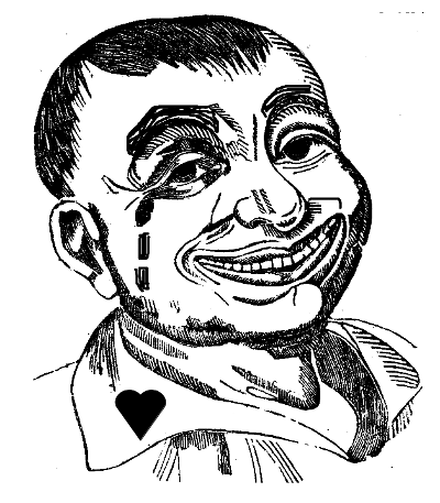
The face of not having nice things in music, by Egon Schiele.
Moses and Aron is based entirely on a single tone row, itself constructed from cells…
Okay, what’s a tone row?
In music, a tone row or note row (German: Reihe or Tonreihe), also series or set, is a non-repetitive ordering of a set of pitch-classes, typically of the twelve notes in musical set theory of the chromatic scale, though both larger and smaller sets are sometimes found.
Okay, what’s musical set theory?
Musical set theory provides concepts for categorizing musical objects and describing their relationships.
Right at the beginning of that article is a helpful illustration with this caption:
Example of Z-relation on two pitch sets analyzable as or derivable from Z17, with intervals between pitch classes labeled for ease of comparison between the two sets and their common interval vector, 212320
The reason we can’t have nice things in music is that only people who find this stuff absolutely fascinating are allowed to write serious music.
NEWLY DISCOVERED RELIEF DEPICTS JEPHTHAH’S ISRAELITE ARMY BATTLING THE AMMONITES.

See Judges 11.
ART CORNER.

Not Quite Horizontal Line, Almost but Not Quite Centered Vertically.

Not Quite Horizontal Line, Almost but Not Quite Centered Vertically, in Opposite Colors, to Make You Wonder Whether You Saw This Painting Already.

Perfectly Vertically Centered Horizontal Line, Maddeningly Extending Almost but Not Quite All the Way to the Right Edge.

Vertically Centered Horizontal Line—OR IS IT?

Diagonal Line in Exactly the Wrong Place.

Bunch of Lines in the Wrong Colors.
NEWLY DISCOVERED RENAISSANCE PORTRAIT.

The original woodcut, of course, represented the bull alone, illustrating the article De Tauro in the 1551 edition of the Historiae Animalium of Conradus Gesnerus. It was hand-colored, probably soon after the book was originally purchased. Some time later, a talented artist of the grotesque school, known for its combining of human with animal and vegetable forms, added the head in profile arising from the rearward parts of the animal.
What is the meaning of this unusual juxtaposition? Doubtless the artist meant to compliment his friend or patron by associating him with the power and nobility of the bull. Centuries later, we can no longer identify the subject of the portrait, but the intended compliment is legible to a wider audience than the artist could ever have imagined.