Posts by Dr. Boli
Advertisement.

PASTA NAMES AND THEIR MEANINGS.
The Italian staple known as pasta comes in an almost infinite variety of shapes and textures. English-speaking diners may be unaware that the traditional names of these varieties usually describe their appearance in terms of some everyday object, often a strikingly unappetizing one.
Spaghetti—little strings
Vermicelli—little worms
Linguine—little tongues
Botticelli—little boxes
Lamborghini—little lambs
Mussolini—little mice
Vittorioemanuelini—little Victor Emmanuels
Portatili—little computers
Samovaretti—little samovars
Guarnizionette—little gaskets
Erpetologini—little herpetologists
Radiatori—radiators
FROM THE ILLUSTRATED EDITION.

OUR VALUED CORRESPONDENTS.
Every so often we receive a compliment from our readers, and we should not like those readers to think they are unappreciated. Here is one of the recent comments, which we reprint verbatim et literatim:
Every weekend i used to pay a visit this site, as i wish for enjoyment, since this this web site conations actually fastidious funny information too.
LETTER TO THE EDITOR.
Sir: This afternoon I was driving through a residential area, and I passed a sign that I thought was really quite clever. It said “speed limit 25,” and then below that, “your speed,” with—and this is the really clever part—an electronic display showing exactly how fast I was going.
That was extremely useful information. I had no idea I was driving at 68 miles per hour past the orphanage and the home for retired invalids, and of course I slowed down immediately.
At once I began to think how useful it would be if those signs were everywhere, so that I could always know how fast I was driving. Think how convenient that would be! But of course it would involve considerable expense, perhaps more than our already stretched highway budget could accommodate.
And then, quite suddenly, I was hit by an inspiration. What if, instead of signs along the road, the display were inside the car itself? Then I could always know how fast I was driving, with no need to rely on the thoroughness of the municipal sign-posting authorities. What if every motor vehicle on the road were equipped with some sort of device that would constantly display the exact speed of that vehicle? Law enforcement would be rendered almost redundant; for I am convinced, as every charitable soul must be, that “speeding” is largely a crime of ignorance.
If I were mechanically or electronically inclined, I should at once set out to design and patent such a device, and then market it under a catchy name—“Speed-O-Measurer” or something like that—confident that I should soon become wealthy on the revenues of so obviously useful an invention. However, as a sincere lover of humanity who is also all thumbs (I mean that literally; it is a rare medical condition having something to do with that DNA stuff), I have decided to publish this idea for the benefit of the whole world, hoping that the automotive companies will take notice.
Perhaps I shall live to see the day when it is no longer necessary for municipalities to post signs of the sort I have described, because every vehicle on the road will be able to measure its own speed. Or even if it is not technically feasible now, perhaps my letter will plant an intellectual seed that will ripen in the age of my children’s children. It is never too late for a good idea. —Sincerely, Landelin Melchor, Spring Hill.
FROM THE ILLUSTRATED EDITION.

THE TYPEFOUNDER AS OPIUM-EATER.
The “index,” or pointing finger, is a useful item in any printer’s shop, and Dr. Boli keeps a stock of them on hand (so to speak) at the service of his advertisers.

As you can see from Dr. Boli’s collection, it is possible to imagine the index dressed up in many different ways, from Greek philosopher to modern businessman; it will still perform its function of pointing at things, and it will do so without giving the reader nightmares.
But there are times when typefounders, like other fallible mortals, run badly off the rails. In 1889 a certain designer at the Franklin Type Foundry in Cincinnati, perhaps under the influence of substances that were then perfectly legal, though not advised for recreational use, produced two of the most disturbing indexes ever crafted by an engraver. They are so disturbing, in fact, that you must first promise Dr. Boli that he will not be held responsible for your mental health; and only then may you proceed.
(more…)ON THIS DAY IN HISTORY.

On this day in 1854, the SS Arctic sank with the loss of almost all her passengers. The crew, however, knowing that there were lifeboats for fewer than half the passengers, took all the boats themselves to spare the passengers the agony of making difficult decisions. The public outcry after the disaster convinced the owners of steamship lines that something ought to be done, and in the future captains were sternly ordered not to sink their ships, thus rendering an expensive investment in extra lifeboats unnecessary.
The picture shows a badly eroded but still lively relief depicting the disaster on the monument to James B. Hogg, a prominent Pittsburgher who was among those shoved aside by the crew in their dash for the lifeboats. Our friend Father Pitt has color pictures of the monument at his Pittsburgh Cemeteries site.
MORE ON WORDPRESS AND POETRY.
[An update: WordPress now includes a “Verse” block that makes it possible to format poetry visually. It took many years, but it finally happened.]
Our suggestion that WordPress needed a poetry plugin provoked a number of helpful comments. “Sigivald,” for example, wrote:
I suggest the reform of simply banning poetry.
It’s much simpler, and therefore the preferable course.
“Captain DaFt” suggested a clever way of turning up genuinely useful information in the WordPress forums; and “fred” put quite a bit of work into a demonstration of CSS techniques, all of which the WordPress comment system promptly nullified, because WordPress does that.
All these suggestions are useful.
Banning poetry, for example, might cause us to lose two or three masterpieces, but it would spare us tens of millions of soul-withering lines from shallow people with deep feelings.
The WordPress forums are full of people asking how to format poetry. They get helpful responses: you can use CSS, in effect writing a poem-constructing program somewhat longer than the average poem it will be used to construct. You can use nonbreaking spaces, being aware that they will periodically disappear. You can use the “pre” tag.
The “pre” tag activates your default ugly monospaced font. (This is true, by the way, in ebook readers as well.) One would not want to use that for publishing poetry:
I see beneath the crystal bow,
   And Gaul and German, Russ and Turk,
   Each with his native handiwork
                      And busy tongue.
It is possible to redefine that behavior in the WordPress theme by specifying a proportional font, making the “pre” tag probably the best choice for a poet who expects to write a lot of poetry and is willing to deal with the small alterations in CSS for his chosen theme. [Another update: This is what Dr. Boli has done here on the site, so that the demonstration above looks much better than it looked when the article was published.] Even then, though, indenting lines with a bunch of spaces is a sloppy and tedious task, made sloppier and tediouser, and in some more complex forms impossible, if the “pre” tag is redefined to specify a proportional font. [An update: A commenter below mentions custom stylings for the “pre” tag, but, having tried the experiment, Dr. Boli is delighted to report that WordPress, at least with the theme he tried, simply ignores those custom stylings. It is therefore necessary to revise the theme itself.]
What the poet wants is to be able to say, “I shall set the beginnings of all lines of this sort here.” One can do that with an early-twentieth-century mechanical typewriter by pushing the “tab set” button. It is very strange that one cannot do it at all with a sophisticated twenty-first-century content-management system.
At any rate, it is absurd to say that prose writers should just be able to go ahead and write, but poets need to teach themselves the intricacies of CSS. The average poet will not be as stubborn as Dr. Boli about making his own WordPress theme when he cannot find one that meets his needs. Nor should he be limited to one WordPress theme. There should be some way to make the mechanics of formatting simple and transparent, so that the poet can just write poetry. After all, it is always possible (however unlikely it may seem) that, having all the traditional forms of poetry easily available to them without any tedious labor or programming skills, a few poets may start to write good poetry.
A PLEA TO WORDPRESS PLUGIN DEVELOPERS.
[An update: WordPress now includes a “Verse” block that makes it possible to format poetry visually. It took many years, but it finally happened. The block is much more simpleminded than what Dr. Boli proposed in this article, but it does at least preserve spacing used as indentation.]
You can tell the Internet was invented after the death of poetry, because HTML, the engine that formats the World-Wide Web, has no way of dealing with even the most elementary poetic form—such as, for example, a ballad.
Here is a stanza from a ballad by Thackeray:
It is perfectly simple; there is not a simpler poetic form. But how would one achieve those simple and obvious indentations in HTML?
One might add spaces at the beginnings of lines. But it won’t work, because, like most of the Internet, one uses WordPress. And WordPress will look at a series of spaces at the beginning of a line and panic. “How did those get there?” it will say. “I’ll get rid of them at once, before anybody notices.”
You may recall that, two days ago, Dr. Boli published a little poem whose form was not especially complex, but nevertheless required indenting some of the lines. The only practical way to do that is by adding codes for nonbreaking spaces.
Here is how the poem looked while it was being set in WordPress type.
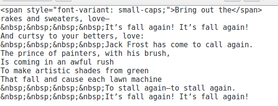 That, you will agree, is very cumbersome; but we have not come to the worst part. Here is the worst part: that article is uneditable. If one needs to change as much as a single comma, one will lose all the formatting, because before opening the post for editing, WordPress will have another panic attack. “Nonbreaking spaces!” it will wail in a quavering and slightly tinny voice. “Something terrible must have happened!” And the formatting is gone forever.
One can, of course, maintain a copy of the post in a text editor, as Dr. Boli has done. It is also possible to define CSS styles that can be applied to different lines and add them to the WordPress theme. But the point of using software like WordPress, instead of composing in straight HTML, is to be able to get on with the business of writing without having to think about HTML code. Just think how ugly the code would be if the form of the poem were only a little more complex:
This is a serious problem for the whole Internet. Although poetry has died as a category of commercial publishing, it is still practiced as a craft, in the same way that people make pictures out of macaroni without ever expecting to go into the macaroni-picture business on an industrial scale. By the most conservative estimate, there are approximately one gazillion poetry bloggers typing their witterings into computers right now. They find it impossible to write poems with any form at all; their development as artists runs into the stone wall that is WordPress.
What the world desperately needs is a poetry plugin for WordPress. A worldwide publishing empire does not run itself, and Dr. Boli does not have time to figure out the WordPress plugin system and write the thing on his own. But it should not be difficult for someone experienced in that sort of programming.
Here are the features we desperately need:
1. When we are writing poetry, single-spaced lines must be the default.
2. Lines that run over must receive a hanging indent automatically.
3. It must be possible to begin a line at any arbitrary distance from the left margin.
4. It must be possible to remember that arbitrary distance in some way so as to create a class of lines with the same indentation.
5. It would be desirable to have a small number of standard styles, so that, for example, one could choose a “Ballad” style and have every second line indented automatically.
The poets among Dr. Boli’s readers can probably think of a few other features that would be necessary or useful. And if there are any programmers out there looking for a project where the task is not too challenging but the gratitude earned from the literary world would be enormous, here is one you might consider.