Posts by Dr. Boli
TIME FOR A THOROUGH REFORM.
Has anyone besides Dr. Boli noticed that computers are not ideal for handling text? For all their power, they have to be pushed and prodded into creating text that is merely adequate typographically. This is mostly because they are doing work they were not designed to do. They did not evolve as typesetting machines, just as humans did not evolve as flying animals. We can fly now, but it takes a great deal of mechanical ingenuity to do it; we can typeset pages on a computer now, but it takes many adaptations on the part of the writer and designer that ought not to be necessary.
Some of these problems are in hardware, and the rest are in software. On the hardware side, we have a keyboard that is inadequate for proper and correct typeset work. On the software side, we have many inadequate adaptations to our inadequate keyboards.
But suppose we were putting together a real writer’s computer—a computer that could, naturally and easily, produce text properly formatted for printing. What characteristics would it have? Dr. Boli has thought about this question for months and scribbled notes as he thought. He invites his readers to do the same and, if they like, scribble their notes in the comments.
- By default, the end-of-sentence space should be a different character from the between-words space. The desideratum is to put the designer in control of sentence spacing without having to change the text at all: it should be easy to decide that the space between sentences is the same as the space between words, or that it is a two-em space, or whatever the designer desires. We should note that not even the question of the serial comma produces as much anger and dogmatism as the question of whether a sentence should be followed by one or two spaces; current fashion among designers is to use a word space after a sentence, but the fashion is not universal, and arguably not good. Text should be easily portable from one style to the other.
☛A possible implementation: a double space could be automatically interpreted (unless the user disables this feature) as an end-of-sentence space. Since so many typists hit two spaces at the end of a sentence anyway, it would fit with already-established habits. - There needs to be a simple mechanism for proper catchwords—that is, a way of providing that the first word of each page should also appear at the bottom of the previous page, as was universally done until about 1800. This should be trivially easy for a computer to accomplish, but even TeX, the most outrageously bloated typesetting software in the computing world, cannot easily do it.
- Why, in the twenty-first century of the Christian era, are there not separate keys for proper quotation marks and apostrophes? Why is there no key for an em dash—one of the most commonly used punctuation marks? Our keyboards are cluttered with characters like the backslash and the tilde (which is not a useful composing tilde for languages like Portuguese and Spanish, but just a sitting-there-naked tilde) that are of use only in dealing with the technical workings of computers, but we have to use clumsy substitutes or awkward key combinations for some of the most basic written symbols.
- How would we put together the ideal writer’s keyboard? Here is a simple way. Look at a typefounder’s specimen book—any time from the early nineteenth century to the end of metal type will do. What characters make up a complete fount in that book? Those are the characters that need to be accessible directly from the keyboard, with no obscure key combinations needed to unlock them.
- Perhaps some contrarian can make a Linotype keyboard with a USB connector, and we can all learn the ETAOIN SHRDLU keyboard layout. Dr. Boli has seen pictures mocked up of such a creation, but as far as he knows it has not been produced.
- It should be easy to add any arbitrary text in the margin and link it with text in the main column, so that it is always beside that text. In other words, computers ought to be very good at setting marginal headings and notes, or running summaries in the margin. This can be done with TeX; but we said it should be easy, which eliminates that choice.
- It should be very easy to deal with the long S by setting a single switch: “Long S on.” A settings panel could control the rules for different styles and historical periods. The same could be done with U and V, so that it would be possible to switch to Renaissance style, in which V is always initial and U is found in all other positions (“vnto,” “very,” “moue,” “blue”). The point of being able to flip a switch is to be able to flip it back again, so that the same text could be printed with the long S and without, or with Renaissance and modern use of U and V.
- It should be easy to set a last-paragraph style that would taper to a triangular point, as a proper Renaissance printer would do. Settings would control number of lines to taper and narrowness of the point.
- Position-dependent styles should work without thinking. We should not have to tell the software that the first paragraph is the first paragraph: it should know that it is because it follows a heading (or other marker that we choose), and then it should apply first-paragraph attributes to that paragraph. If that paragraph moves, or another is inserted before it, then the computer should know that it is no longer the first paragraph. The same is true for last paragraphs, of course.
- The same letter should not always look exactly the same. There should be subtle random variations, as there are in metal type.
- Now here is a wild desktop-publishing fantasy. Knowing that most text is displayed on screens or printed on smooth paper, we might nevertheless be able to simulate the appearance of ink on rag paper, adding a healthy irregularity to type. The parameters of the virtual texture of the paper should be adjustable.
These are some of the things Dr. Boli would find desirable in a true typesetting computer. What has he left out? What else do the writers out there miss that should be easy to implement on a computer, but unaccountably has not been implemented?
Advertisement.

Advertisement.

WHAT’S IN A NAME?
In the course of preparing a page on Slavery in the United States for his Eclectic Library, Dr. Boli ran across a pamphlet entitled “The Despotism of Freedom; or the tyranny and cruelty of American republican slave-masters, shown to be the worst in the world; in a speech, delivered at the first anniversary of the New England Anti-Slavery Society, 1833.” It was published by the Boston Young Men’s Anti-Slavery Association for the Diffusion of Truth in 1833, and inside the front cover is the text of the Constitution of the Boston Young Men’s Anti-Slavery Association for the Diffusion of Truth, or BYMASADF, as we suppose it was familiarly known. “Article 1: This Association shall be called the Boston Young Men’s Anti-Slavery Association for the Diffusion of Truth.”
The last article is a mechanism for amendments to this constitution, and we have an amendment to propose.
From DR. BOLI’S ENCYCLOPEDIA OF MISINFORMATION,
Third Series.
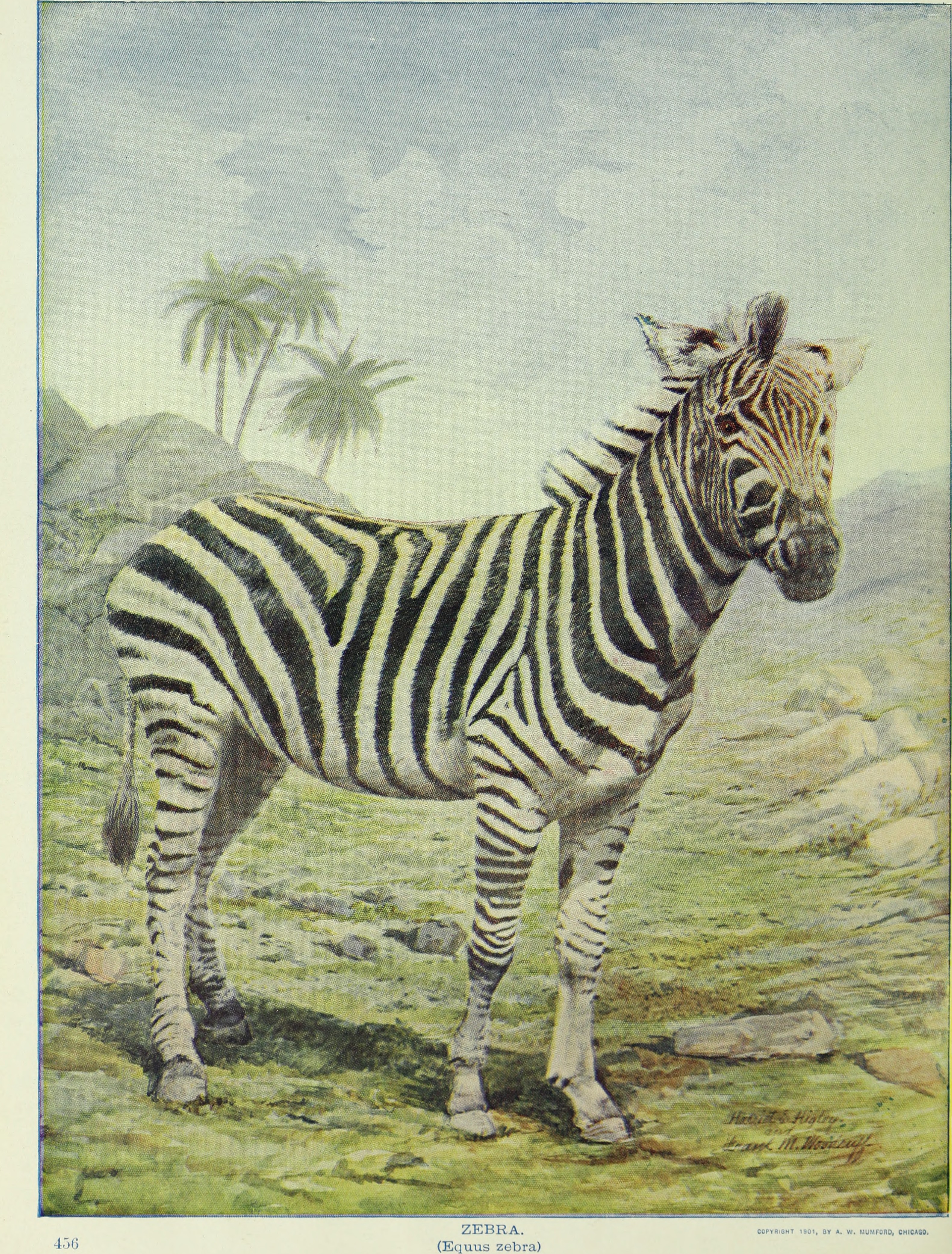
Zebra.—Zoologists attempting to answer the age-old question of whether the zebra is a black animal with white stripes or a white animal with black stripes finally announced, after several years of work, the startling finding that the zebra is a green animal entirely covered in black and white stripes.
DR. BOLI’S PRESS-CLIPPING BUREAU.
—
UNESCO ADDS PITTSBURGH LEFT TO HERITAGE LIST
PITTSBURGH (Special to the Dispatch).—The United Nations Educational, Scientific and Cultural Organization announced today that the Pittsburgh Left has been added to UNESCO’s Representative List of the Intangible Cultural Heritage of Humanity.
“The practice of making a left turn just before the light turns green,” the text of the original nomination declares, “while not unique to Pittsburgh, has been developed there to such a degree as to constitute a recognizable form of folk art.”
“Safeguarding our intangible cultural heritage depends on transferring of knowledge from one generation to the next,” said a UNESCO statement read by a children’s choir at the corner of Forbes and Murray in Squirrel Hill. “Conditions must be maintained in which cultural traditions can thrive. The Pittsburgh Left would be endangered if modern left-turn cycles were added to previously existing traffic signals.”
A spokeswoman for the Department of Public Works later replied in a prepared statement that “UNESCO shouldn’t lose much sleep over that.”
IN ENTERTAINMENT NEWS.

Popular middlebrow band The Luxurious Socks have wrapped up recording on their pandemic-themed album, Learn to Be Nice. In addition to the title track, the new album will include “Twitter, My Only Friend,” “I Would Do Unto Others if I Could Find Any,” “I Like Canned Beans Now,” and the up-tempo end-of-pandemic anthem “Gazing at Her Navel (Instead of Mine).”
Rap-jazz fusion artist Felonious Thelonious was arrested for an unresolved F7 chord. He was released without charge on presenting proof that the chord would be resolved in his next album.
Miss Diana Smoulder, the ravishing heartthrob of the hurdy-gurdy, has extended her fourth farewell tour for six more months. New stops on the tour include Meddybemps (Maine), Coosawhatchie (South Carolina), Cocked Hat (Delaware), and the parking lot of Herb’s Convenience Store and Beer Palace in Paw Paw (West Virginia). Tickets are already on sale for Miss Smoulder’s fifth farewell tour beginning next year.
British rock legend Sir Jeremy Freakout has announced a new charity initiative in support of the Potted Plant Liberation Front.
Teenie Sparkle, the host of the popular children’s program Sparkle Park, has signed a six-year contract with the Ahoskie Power Saw Manufacturing Company of Ahoskie, North Carolina, which hopes her influence will help promote the use of power saws among the underserved kindergarten and first-grade demographic.
Advertisement.

ASK DR. BOLI.

Dear Dr. Boli: I hear people talking about the “Fine Arts,” the “Useful Arts,” and so on. What is the distinction they are making? —Sincerely, Ann Ellers, Acting Chairman, National Endowment for the Arts.
Dear Madam: There are several generally recognized levels of art, and perhaps the best way to make the differences clear would be to give several examples of each.
The Fine Arts: Painting, sculpture, classical music, poetry, novels that no one buys, novels that everyone buys but no one reads.
The Pretty Good Arts: Illustration, popular music, movies, Broadway musicals, television shows, novels that people buy and read.
The Useful Arts: Architecture, cookery, garden design, plumbing, graphic design.
The Embarrassing Arts: Singing telegrams, macramé, karaoke, mime, advertising, performance art.
Dr. Boli hopes these examples will make the distinctions clear and be of some assistance in your work.
Advertisement.
